The School ID Logo System
We built our logo for our brand. But the system around it shows how flexible, story-aligned branding can work for schools of all kinds.
A logo isn’t the brand. It’s one part of a system that helps visualize it clearly, consistently, and in context.
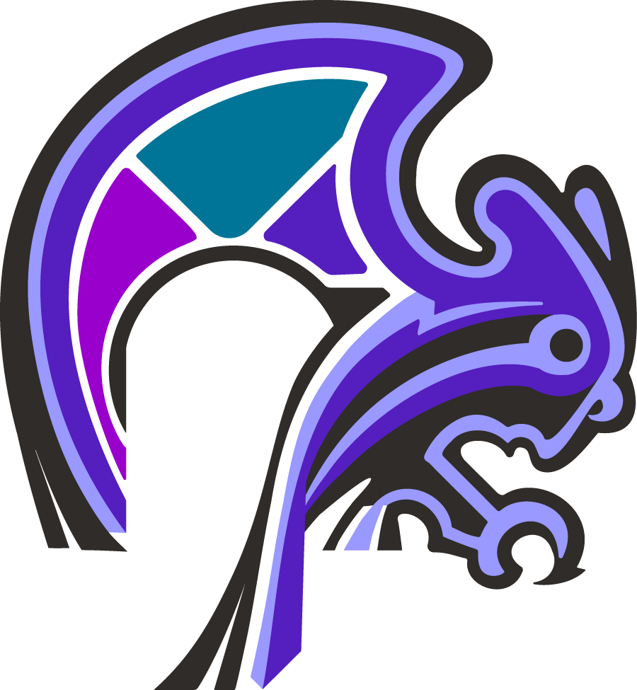
Meet Stori, Our wise guide. Stori is inspired by the Oriental Scops Owl (Otus sunia), a small, observant bird from Southeast Asia. Slight and alert, she listens before she speaks. Her head tilt signals attentiveness and reflection. The geometric blocks in her wing connects her to the grid structures and modular system that appear throughout our brand and underlying strategy.
Stori is more illustrative than a standard emblem, yet still clean, scalable, and grounded in geometry. Built on a 45-degree grid and shaped with simple circles, she feels intentional and balanced.
Stori doesn’t tell a story. She symbolizes the system that makes stories possible. She listens first, signals belonging, and reflects intentional design.
This is our logo. Our symbol of our brand. For schools, we start by listening, engaging with all parts of the community to find out where their story already lives before we even think about touching a logo. It’s unlikely a school would want an owl as its core identity. And maybe their current logo just needs a small shift—whether that’s a recolor, a simplification, or softened edges. It depends on what we hear and what that logo needs to represent.
To demonstrate our thinking around logo systems and to fully bring our strategy into visual form, we built an entire identity system around story and her modular blocks.
PHOTO: ENVATO
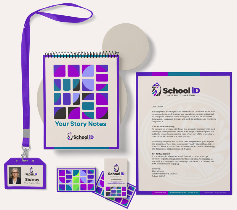
Systems for Showing Story
Schools show up in a lot of places. Some are predictable, some not. From formal transcripts to casual merch, from a favicon in a browser tab to a podium seal at graduation, schools need their brand to show up consistently across very different contexts.
We needed a system too, one that worked in small spaces, stayed visually consistent, and reflected our strategy. We build modular systems to help schools manage their brand so an authentic story can emerge and build community. In short: belonging through story.
Our own system reflects this. The color, structure, and visual language are designed to show modular thinking and evoke belonging and connection.
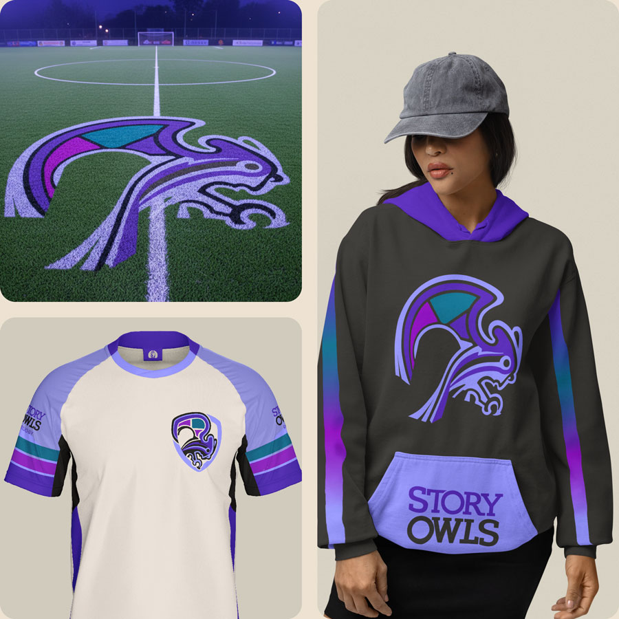
No, we do not need a football mascot, but we included one as a demonstration of what is possible. This system shows the kind of flexibility we can create for schools, whether we design it ourselves or partner with in-house teams, local agencies, or freelancers.
What matters is showing how logos and visuals can work as a system, especially for international schools. When a school has too many logos, or ones that do not relate to each other, it starts to feel fractured. Multiple marks should not look like multiple brands.
Flexibility matters. So does coherence.
A good logo system is not rigid, but it is connected. For both schools and School ID, each variation should carry the same tone and structure, even when used in different ways. Formal marks, mascots, favicons, and promotional illustrations all speak the same visual language.
Every version does not need to match exactly. But they should rhyme.
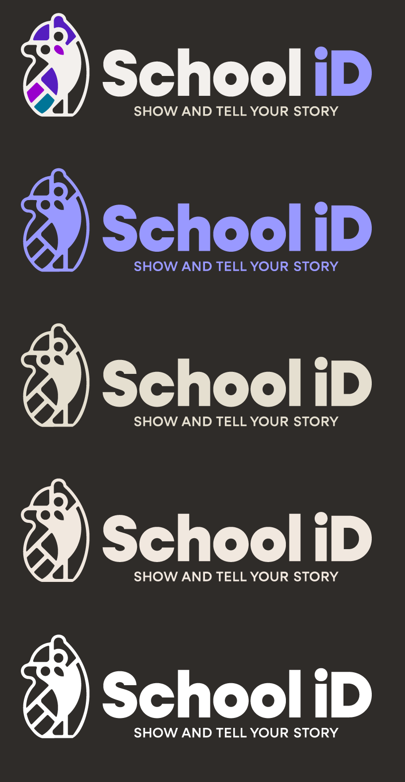
Primary Logo
Our full mark and wordmark combination is used wherever awareness and ownership matter most. It’s the cornerstone of our visual identity. Within the system, we’ve built specialized variations for different formats and contexts—each defined clearly in our Brand Book to ensure consistency and clarity.
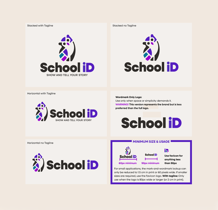
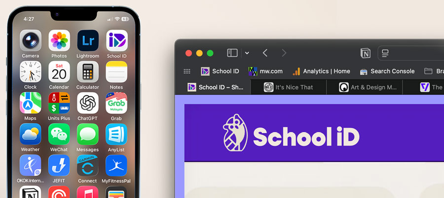
ID Favicon
Our ID favicon keeps the brand recognizable even in the smallest digital spaces. At 16 or 32 pixels, the full logo would blur or disappear. This simplified mark holds our core geometry and tone, staying clear and intentional where space is tight. It also serves as our social media badge.
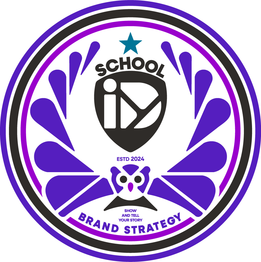
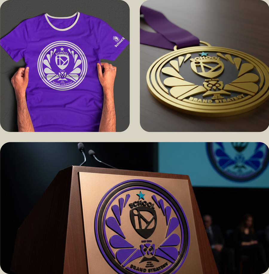
The School ID Seal
Our seal is our most formal mark. It’s a nod to traditional school emblems and signals recognition, tradition, and gravity. This is what we’d place on a podium or stamp on a diploma. Built from the same elements as our logo, it doesn’t break the system, it deepens it. We use it to mark our own work, brand partnerships, or any moment that deserves to be honored with clarity and weight.
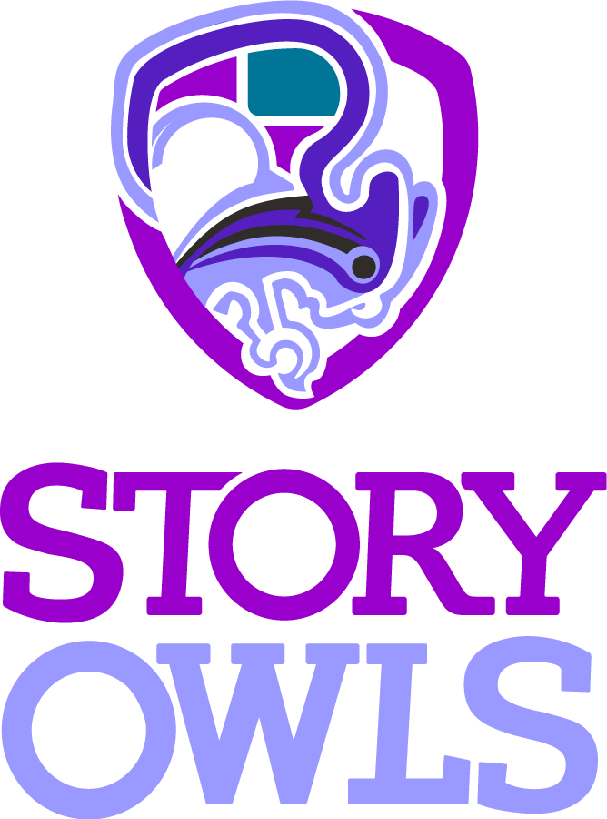
Mascot Logo & Full Illustration
Some schools need more than one logo, especially for extracurriculars. The key is making them work together.
Our mascot logo is built from the same visual logic as our primary mark. It supports the brand rather than competing with it. That way, spirit elements like jerseys or club shirts feel like they belong, not like they’re telling a separate story.
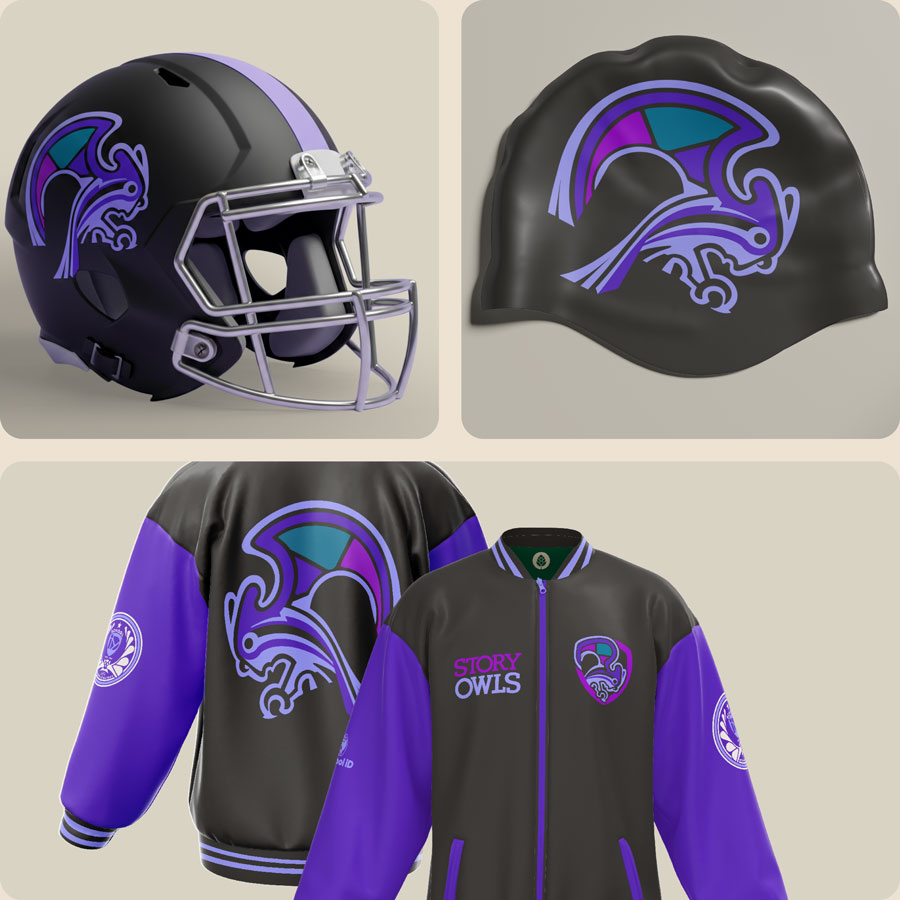
We also created a full illustration of the mascot owl to bring even more energy and personality into the system. They’re too detailed for small-scale use, but they play an important role. They show the full mascot character without breaking the visual language. Our sports items tend to feature more of our dark background, embracing the nocturnal aspect of the owl.
We don’t have sports teams, but we built the Story Owls to show how a mascot can live inside a brand system. Same geometry. Same tone. Still fun.

Supporting the Logos with Illustration
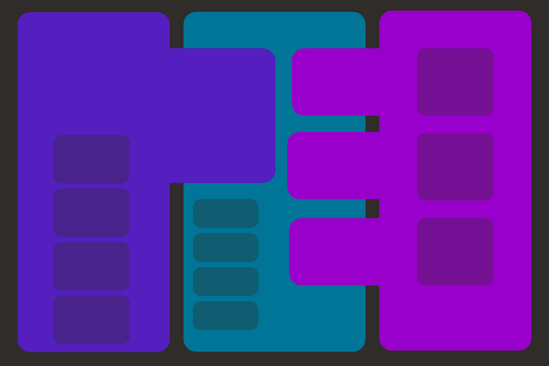
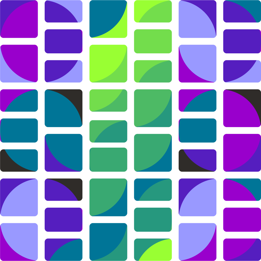
We often use grid patterns in the illustrations that support our logos. While some brands lean on photography, ours leans on illustration. That’s because what we offer can’t really be photographed. You can’t point a camera at a brand strategy.
The example shown here directly reflects our OWL Brand Management Model. Vertical columns represent core community and true identity, interacting to create our authentic story. It’s not just decorative. It’s a visual explanation of how strategy and story interact.
Reflection: Bringing It All Together
We have seen schools with five logos and no alignment, and others afraid to add a second mark, even when they need one. Everything also needs to work across platforms and in both light and dark environments.
A good logo system does not limit expression. It guides it.
What we built for School ID reflects how we design for schools: flexible, consistent, and rooted in identity. The goal is not to make everything match. It is to make everything feel like it came from the same place.
Ready to build your system?
If your school needs stronger alignment between identity and expression, we can help. Whether you’re starting from strategy or ready to bring your story to life visually, we build systems that connect.