Designing for Interaction
Color is not a choice you make once, but relationships you manage.
“In visual perception a color is almost never seen as it really is — as it physically is. This fact makes color the most relative medium in art.”
— Josef Albers, Interaction of Color (1963)
I first read Josef Albers’ Interaction of Color in a university color theory class, and it’s still the one textbook I’ve kept and still reach for.
What Albers meant is that color has no fixed truth.
A blue square doesn’t look the same when it sits on yellow as it does on gray.
As shown in the illustration of oranges and blue, adapted from the artwork on Albers’ original book,
light, contrast, and neighboring colors all shape what we perceive. Our eyes are constantly comparing. Color only exists in relationship.
The rust-orange center blocks are identical in hue and value, yet their appearance shifts dramatically depending on the surrounding colors.
Why great color systems behave like great classrooms.
That process reminds us of something every school knows well: forming homeroom classes.
Each spring, teachers and counselors spend months creating the right mix of personalities, learning styles, and dynamics for every class. It continues through the planning weeks before the school year and leads up to one of the most anticipated announcements of the fall, just before school begins.
It’s not about finding one “perfect” student or teacher.
It’s about the fit, how each student complements the others and how the class as a whole matches a teacher’s style. The goal is balance, chemistry, and a classroom where everyone can thrive.
Building a color system works the same way.
A single color can’t carry the tone of a whole brand. Its meaning changes depending on its surroundings.
In an international school context, where colors also carry different cultural associations, harmony matters even more.
Instead of searching for the one color that feels universally right, we design for relationship, choosing colors that behave well together and bring out the best in each other.
What Color is Harmony?
Color Harmony in the WAB Website
Creative direction by Matt Wehner, founder of School ID. Web design, development, and hosting by Finalsite. Content and site strategy in collaboration with Western Academy of Beijing’s in-house communications team.
WAB’s Colors
Brand and color strategy by Matt Wehner, founder of School ID.
Visual system partner: Meat Studio (Beijing).
Western Academy of Beijing – Designing for Harmony
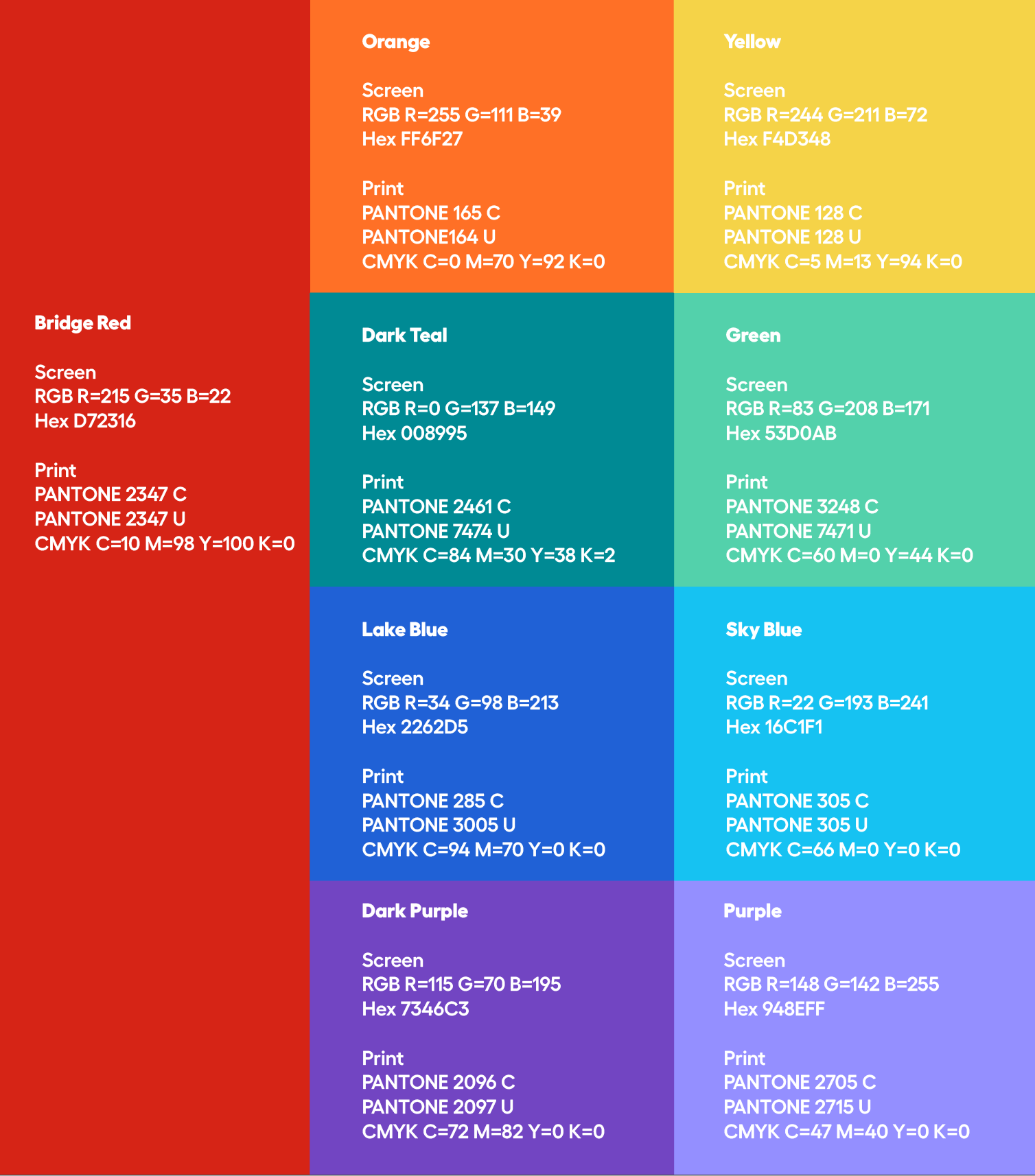
From the start, WAB was clear that the school’s core colors would remain Red and Yellow to honor its connection to China.
When we spoke with the community, that choice resonated deeply, but their story turned out to be far more colorful.
The WAB spirit is joyful, diverse, and expressive. Families described a school alive with creativity and warmth, not confined to two hues. The challenge was to design a system that could hold all that color while still feeling coherent.
The answer was harmony.
We introduced three cool tones of Teal, Blue, and Purple to complement the warmth of Red and Gold without competing for attention. Each is distinct yet closely related. When used together, they create calm balance across a very colorful system.
Those three became the quiet center of the palette, the link that allows all other colors to interact without chaos. They bring down the intensity, create consistency across materials, and reflect WAB’s deeper sense of belonging, where challenge is balanced with curiosity and energy is balanced with care.
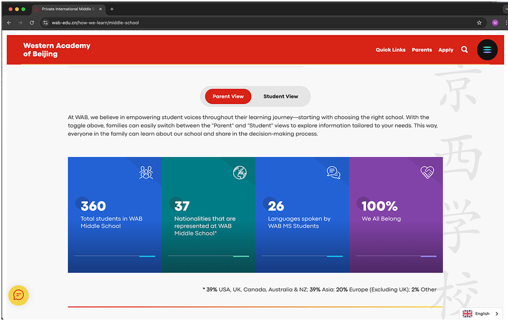
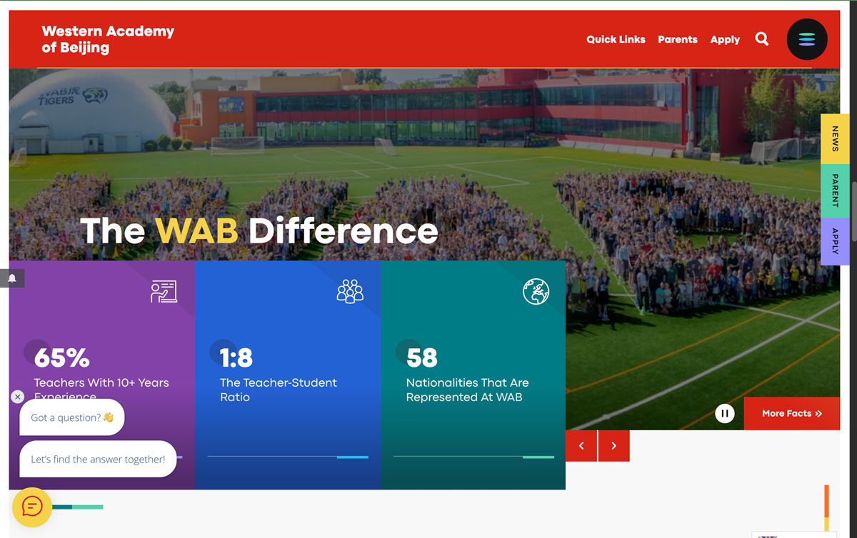
Importantly, we did not abandon WAB’s key colors of red and yellow. The WAB website, developed in partnership with Finalsite, is a clear example of how these remain central to the brand. All headers and footers across the site use red as the foundation, keeping the identity grounded and consistent. Yellow is used intentionally to guide the eye. The areas that appear in yellow are the ones WAB wants you to notice first. It establishes hierarchy and draws attention to key actions or information.
Harmony doesn’t always come from fewer colors. Sometimes, it comes from colors that understand each other.
Welcoming and Wise
The School ID Brand - Belonging Through Story
What we learned from WAB shaped how we built our own color system.
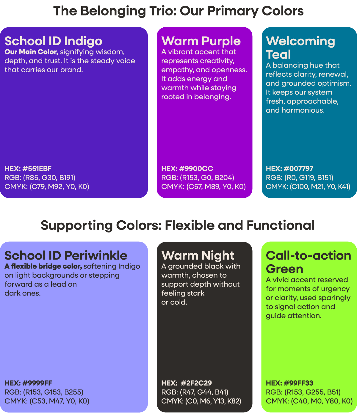
Purple stood out as both wise and warm, a bridge between creative spark and quiet focus.
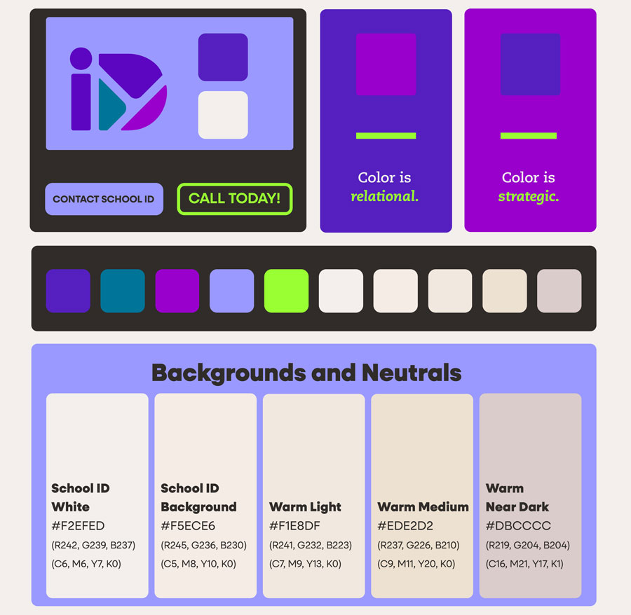
The School ID Belonging Trio — Indigo, Warm Purple, and Welcoming Teal — are related enough to feel like a community, yet distinct enough to express clarity.
As we began testing the new color system within the WAB community, one insight stood out immediately: school leaders were drawn to the purple. That observation stayed with us when we began developing the School ID palette.
Even in early brainstorming, the brand appeared to lean naturally toward purple. It carried the same traits that had connected at WAB, a sense of wisdom, creativity, and quiet confidence. Purple balances calm coolness with a hint of warmth from red, standing out in a school industry crowded with corporate blues. Blue is timeless and balanced, but purple offers that same wisdom with an added spark of imagination.
Reflecting on What We Learned from Our Community.
he School ID brand did not need a palette as vast as WAB’s. It needed to show focus, clarity, and intentionality. Yet the trio concept felt worth repeating. Like WAB’s three related hues, our colors are chosen for how they interact and what they signal together. Here, there is no blue, and the colors are more distinct from one another. Clarity matters more than harmony, but they still need to live well beside each other and align with our carefully defined supporting and background tones.
As we listened to our own community, one theme rose above all others: belonging had to come through in everything we do, including our colors. Early concepts paired purple with cool grays. Aesthetically, it worked, but it felt cold and distant. It did not fit our story. The final system uses warm neutrals, tans, and soft off-whites as grounding tones. You will never see a pure white or black background in our materials. Even our darkest tone, Warm Night, carries subtle notes of red and tan.
Our Call-to-Action Green serves a similar role to WAB’s yellow, but it is used more sparingly. It appears only in the most important headlines, action prompts, or to subtly guide the eye in key illustrations.
Every color has a reason, and every reason connects back to belonging.
From Our Brand Book: A Demonstration of Interactions
If you’d like to see how the full system works, contact us for a closer look. It is our brand, but it echoes the same framework we would use for your school.