Seriously, stop me from repeating this over and over.
I really didn’t want my first blog post to be a rant. But I keep encountering the same misconception everywhere, and it’s a big one: Your logo is not your brand. Those visuals you use in your marketing? They’re part of your brand’s expression, but they’re not the brand itself.
Now, I know this point has been made—just Google “your logo is not a brand,” and you’ll find no shortage of articles, memes, and videos venting this frustration. But instead of ranting, let’s dig a little deeper for clarity. I come from a design background, so I understand and appreciate the appeal of colors, graphics, and logos as brand elements. They’re what people first notice, and they have a big role. But they are a reflection of a brand, not the brand itself.
Your school’s brand is the underlying identity that these things should symbolize and reflect. It’s about understanding who you are as a school, what you stand for, and what you genuinely offer to those who matter most. Brand strategy is about getting to that true core and managing it in a way that’s clear and intentional.
Bad ideas are part of the design process, and these early logos were no exception. They not only reinforced a misconception about the name—implying a focus on school ID cards—but also didn’t feel relevant to people in schools. Iterating on these ideas led to a design that better reflects the brand and resonates with its audience.
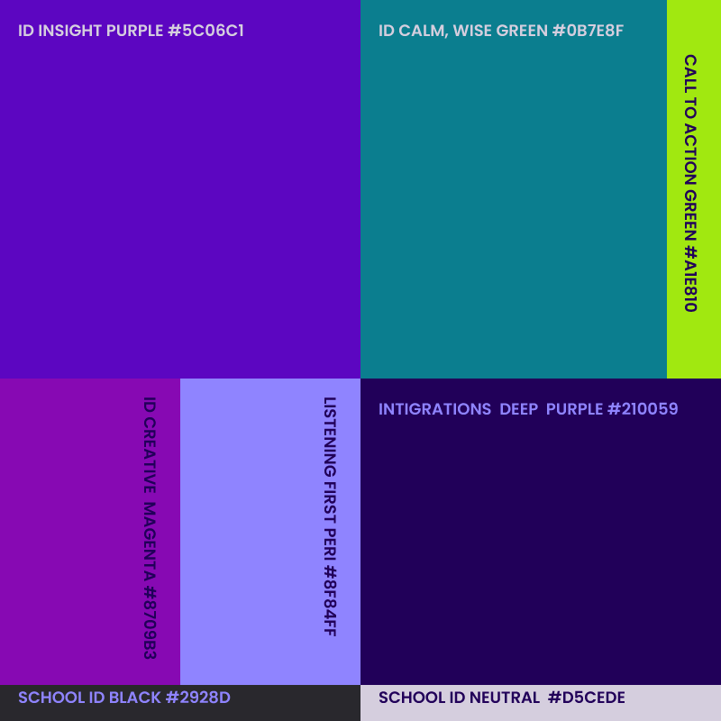
Defining your brand first, helps avoid design errors.
Think of it this way:
Your logo is like the face of your brand, or a tool for making a first impression. Your identity system (colors, typography, etc.) supports that impression and guides viewers toward what’s beneath. Your marketing and communications, and even your school culture and ethos, give people an authentic sense of what your school is about as they get closer. This is why defining your true identity—your brand—should come before designing or reevaluating a logo.
We all manage our personal brands every day, whether we realize it or not. Think about how you post on LinkedIn or social media. You’re aware of how each post will impact how others perceive you, and you shape it to align with the impression you want to create. This is closer to the real brand work we’re talking about.
Before deciding what looks like you, it’s essential to define your true Brand Identity. A comprehensive brand strategy that includes a documentation of Brand Personality, Core Values, Positioning Statement, and Key Audiences should guide the visuals, ensuring they reflect and reinforce your identity effectively. From there, it’s all about consistency. Define a brand voice and visual style rooted in your strategy, and ensure every communication aligns with that definition.